Learning Accessibility as a Designer
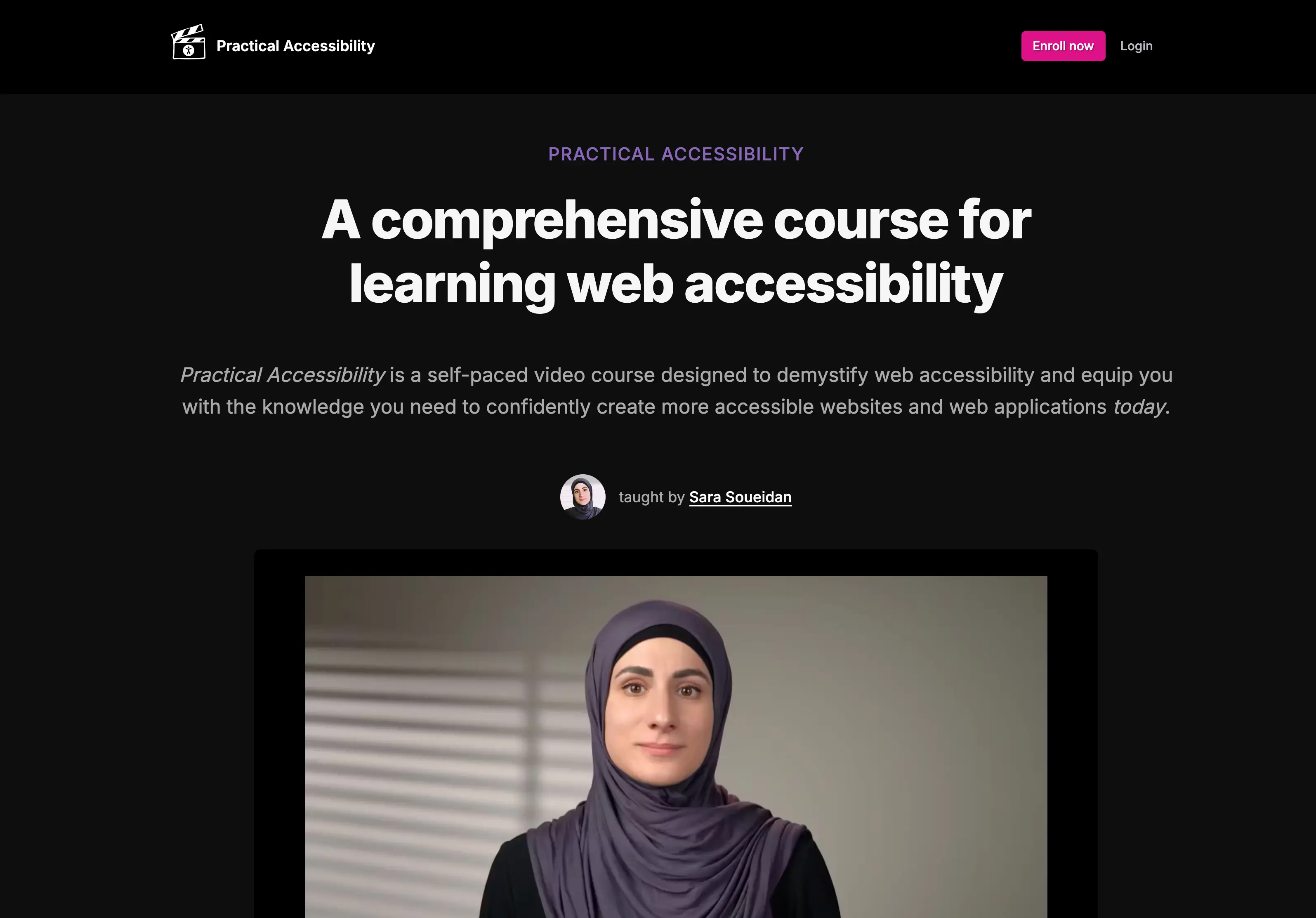
My Take on Sara Soueidan’s Practical Accessibility Course
I’ve taken a few accessibility courses in the past, but most of them were quite academic. They helped lay the groundwork—what accessibility is and why it matters—but I often felt like I was missing the practical side: how to actually design and build for accessibility in the real world.
That’s why I was so glad when one of the developers on our team shared Sara Soueidan’s Practical Accessibility course with us. It turned out to be exactly the kind of hands-on, in-depth (maybe even more than I expected!) learning experience I was looking for.
Course Overview
While the course is primarily aimed at developers, I found it incredibly valuable as a UI/UX designer. It wasn’t a quick watch—some of the 30- to 40-minute videos took me a couple of hours to get through because I kept pausing to take notes, try examples in VS Code, and dive into the extra reading.
Each section includes:
- A video lesson
- A full-text version of the content (which I really appreciated)
- Images and code samples
- Related resources
There’s also a toolkit with accessibility tools and references, plus a changelog to track updates. One thing I really value is the lifetime access—I know I’ll revisit this content when I need a refresher on things like accessible navigation or form structure.
Practical Insights for Designers
One quote stuck with me:
“It’s like trying to navigate a page with your eyes closed, or using a mouse with no cursor.”
It captures the frustration users face when accessibility features are missing.
Beyond the course content itself, two videos from the additional resources really stood out:
- BingO Bakery: Headings, Landmarks, and Tabs highlighted how these elements provide essential structure and speed for users navigating without a mouse.
- A demo of iOS Switch Control by Todd Stabelfeldt emphasized how things like clear labels, minimal interaction steps, and consistent focus order can make a huge difference.
Together, these examples helped me realize that accessibility isn’t just about meeting standards—it’s about designing experiences that actually work for everyone.
Here are a few takeaways that stood out:
- ARIA isn’t magic – I thought of ARIA as a silver bullet for accessibility. But I learned that misusing ARIA can make things worse. Sometimes the best solution is just good semantic HTML.
- Semantic HTML and the accessibility tree – I had a general sense that native HTML tags like
<nav>or<button>were better than generic<div>s, but I didn’t fully understand why. Now I realize that these elements give meaning to the interface. Even though I’m not writing HTML myself, I think more carefully when designing, like questioning if a visual heading in Figma should actually be a real heading, or just styled text. It’s a small shift in thinking, but it’s already shaping how I design. - Interpreting WCAG – Before this course, my understanding of WCAG (Web Content Accessibility Guidelines) mostly focused on color contrast, text size, and target sizes, which are all important, but felt like the full extent of what I could influence as a designer.Now I think more broadly: “Do we have a 'skip to main content' link?” or “Will this interaction make sense to screen reader users?” Even though I’m not building the product, I can leave comments for developers or ask questions during reviews to flag these considerations.
- Focus indicators – A standout tip was the “universal focus indicator”: a white outline layered over a black one to ensure visibility on any background. When designing focus states, usability > aesthetics.
- Buttons vs. Links – I used to treat buttons and links as a visual choice. But now I know: links are for navigation; buttons are for actions. Mixing them up can cause issues for keyboard and screen reader users.
- Disabled buttons – After watching one of the chapters, I brought the topic to the team, and it sparked a great discussion. Is disabling buttons helpful, or does it create confusion? It’s a nuanced topic that probably deserves its own follow-up post.
Would I Recommend It?
Absolutely—especially if you’re a designer with some knowledge of HTML and CSS, and a basic understanding of JavaScript.
Even though I can’t recall every ARIA role or accessibility pattern, building components (buttons, forms, accordions) alongside the videos helped the concepts stick.
In short, Sara Soueidan’s Practical Accessibility course made me a better designer. It gave me a clearer understanding of what inclusive, accessible design looks like—and a better sense of how developers approach it too.