What does it mean to be responsive?
 Maureen Holland
A typical approach to responsive web design is “mobile-first”. Get the essentials right for the smallest canvas and then work up to the desktop design.
But how responsive is your design to user font size preference? Motion preference? Language?
One of the beautiful but difficult things about web design is how much control is in the hands of your users. The final product is not a static design file but a fluid web page, subject to all the possible settings a user can access in their device and browser.
Here are a few ways we took a broader definition of responsiveness into account during the refresh of our own silverorange.com website.
Font Family
When choosing a font, it’s always good to look at glyph and language support. If you’ve skipped this step, any unexpected characters will cause a jarring switch from your carefully chosen font to a generic fallback.
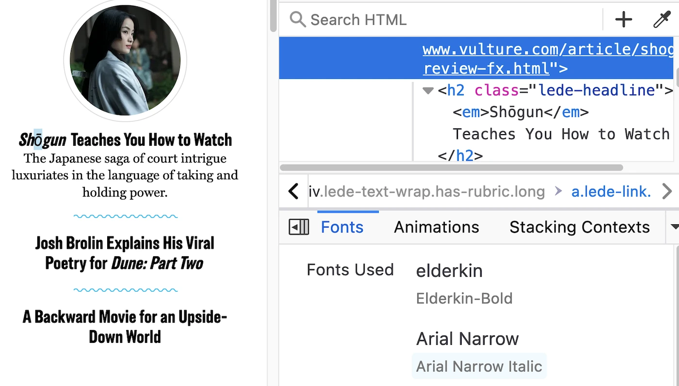
Remember how big a topic the TV series Shōgun was for a minute there? Every culture website got a mini-test in their font capabilities. Some did not pass. Arial Narrow Italic was an eyesore as a fallback.
Stéphanie Walter has a whole presentation on the pain of navigating the web with a “special” character in one’s name. It gets a lot worse than poor aesthetics, particularly where forms are involved.
Aside from being able to properly render names, it’s worth noting that auto-translation is easier than ever, so you might as well assume your content is being rendered in multiple languages.
We made sure to pick fonts that could handle many glyphs and languages:
Font Size
We don’t want users to strain to read our content. While we try to offer generous default sizes, we have to consider these sizes might be adjusted based on user preference.
In deference to this, we use relative units for certain use cases. For font size and some spacing, we use rem to size things relative to the user’s chosen font size. For width media queries, we use em to ensure our design reflows as expected (as Polypane notes, em is the same as rem at media query level, and Safari is buggy with rems in media queries).
Here is the top of the site on Chrome with the default zoom and font size setting for a 1000px width screen:
Here it is with zoom set to 200%:

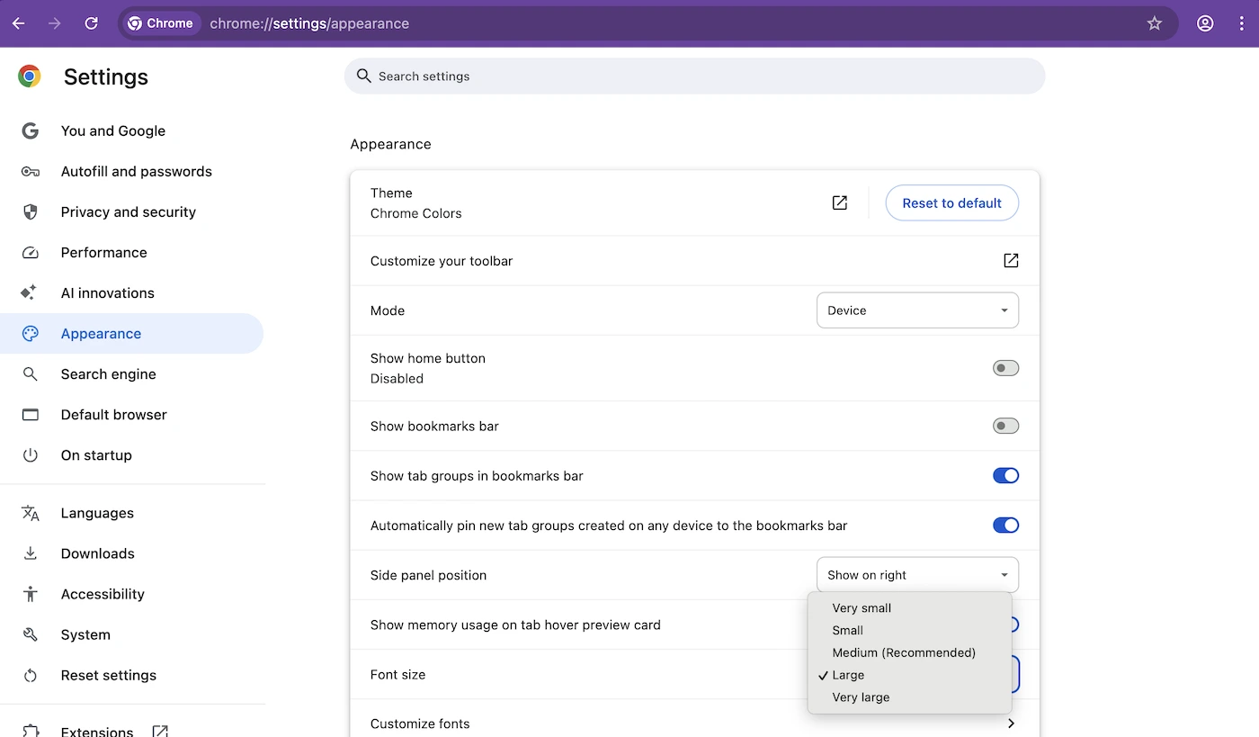
Here it is with font size setting “Large”:
Obviously, screen size isn’t the only variable in play here. It wouldn’t do the user or the design any good to force a two-column desktop layout when the single column mobile layout is more appropriate for these zoom and font size settings.
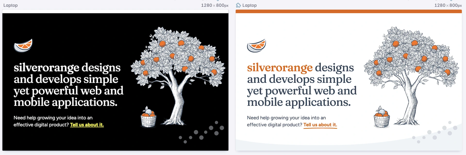
Color
Color contrast is one of the easiest wins you can get! There are many tools to help catch low contrast issues at a design and development level. Yet somehow, 79.1% of the top million home pages in the world fail to meet WCAG guidelines on color contrast.
We can do better.
Our designers have integrated color contrast checks into their workflow and we’ve created a culture where developers are able to speak up if something slips through. It’s never too late to raise a flag and ask for an adjustment.
The next step is to consider High Contrast Mode. I think Polypane gives a great overview of why that name is a bit of a misnomer:
What High contrast mode does is severely limit the palette of available colors, and lets users pick which colors those are, for the things that make up a UI:
- Text
- Background
- Links
- Buttons
Usually users will pick highly contrasting colors for the text and background. But they don't have to. They can also choose to avoid specific colors, create a sepia theme or specifically configure the theme to avoid contrast.
The main feature is that it limits and controls the range of colors, making it easier for users to emphasize content and UI in a way that works for them.
Ideally, you can test with an actual Windows device. But the Polypane browser also has a handy feature to toggle on High Contrast Mode, which allows a side-by-side comparison with the default setting site.
Very minor adjustments were needed to reach parity:
- fill SVGs so they don't rely on white background for color
- revert to the default underline link style instead of our fancy underline when the forced-colors media query is active
And voilà! The site responds beautifully to custom user theme colors.
Motion preference
With great power comes great responsibility and nowhere is this more evident on the web than in animation. Especially scroll-based animation. One user’s delight is another user’s migraine. Or vertigo. Or nausea.
We knew early on that animation would not feature strongly on the MVP version of the site. But we had some small touches in the smooth scroll to the contact section and a few gently waving leaves on our hero tree.
Small touches can still have big impacts. For users who indicate they prefer reduced motion, we remove these smooth scrolling and subtle animation styles.
Importantly, reduced motion does not necessarily mean no motion. We preserve a small animated size bump on the contact email at the bottom of the page when users jump to that section to clearly indicate this is the reason we've moved them.
As someone who often develops animation for the web, I can tell you I set the “reduced” preference a lot. There’s only so many times I’m going to be delighted by an animation I have to stare at for eight hours in a day.
A User-First Approach
When you really think about it, responsive design is more “user-first” than “mobile-first”. Truly responsive design is inclusive of preferences and considerate of circumstances beyond the device. We are responding to so much more than screen size.