Floats are dead! Long live floats!
 Maureen Holland
For a long time, front-end developers had a limited number of layout styling options. This resulted in some creative hacks around the existing browser features. The float property, in particular, was wrangled into many configurations now much better suited to multi-column, flex, or grid layouts.
Using floats for layout is… not fun. It’s kind of like using a screwdriver as a hammer. You might manage to bash a nail mostly into place, but it’s fundamentally the wrong tool for the job. Now we have better tools and fewer hacks, we can have a lot more fun with floats.
Here are a few ways to use floats to their true purpose: floating things!
Classic

We have text and an image. We don’t want the image to be full width or set aside in a separate column, so we “float” it to the side. This creates a new block formatting context that allows text to be aware of the image (not overlap it), but also make use of the entire containing box (flow underneath the image). This can be handy for those tricky “in-between” screen sizes that don’t perfectly fit the mobile or desktop designs.
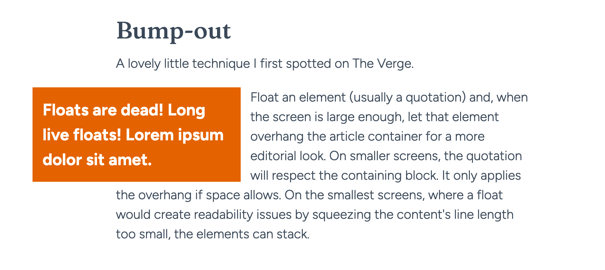
Bump-out
A lovely little technique I first spotted on The Verge.
Floats are dead! Long live floats! Lorem ipsum dolor sit amet. Float an element (usually a quotation) and, when the screen is large enough, let that element overhang the article container for a more editorial look. On smaller screens, the quotation will respect the containing block. It only applies the overhang if space allows. On the smallest screens, where a float would create readability issues by squeezing the content’s line length too small, the elements can stack.
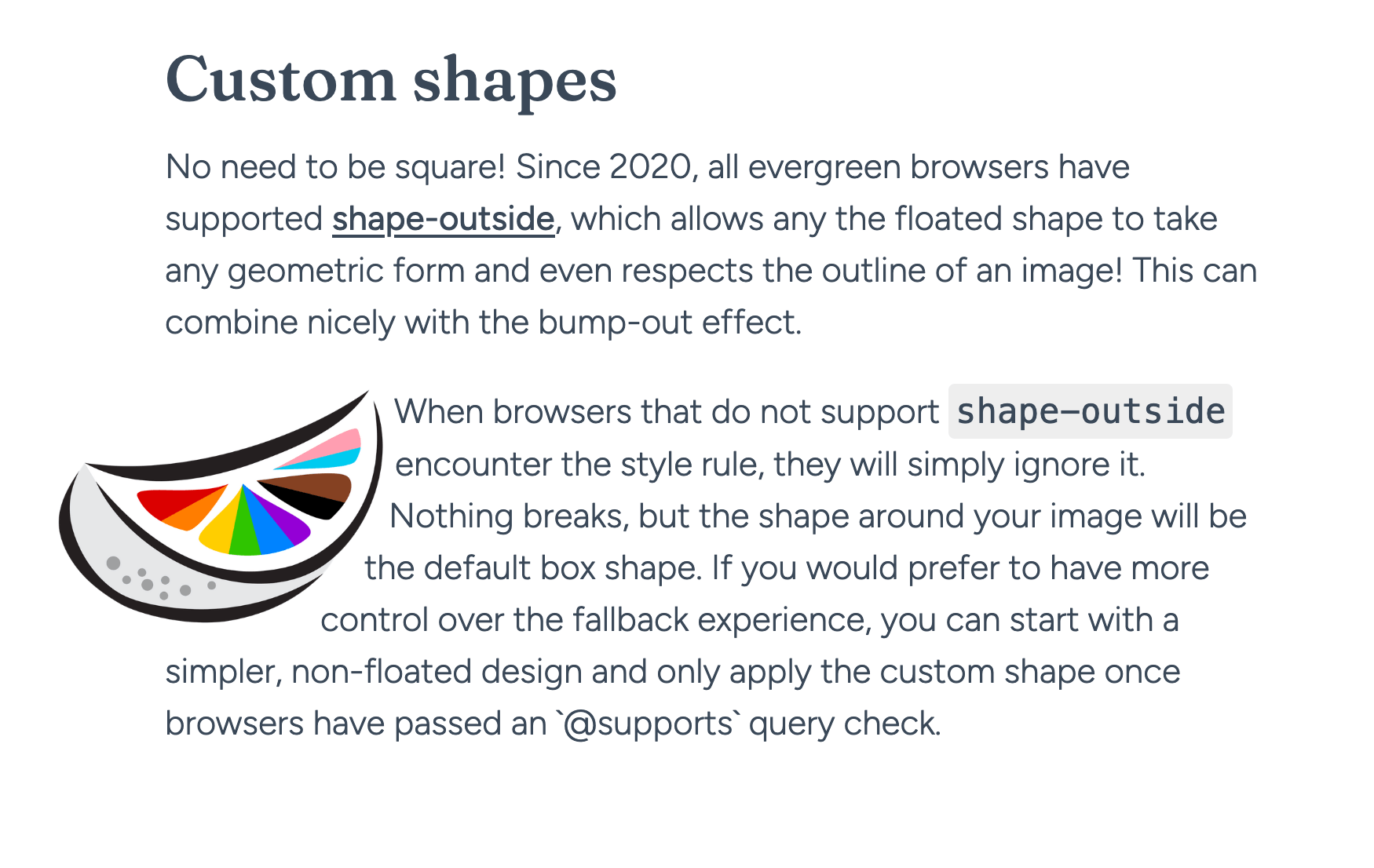
Custom shapes
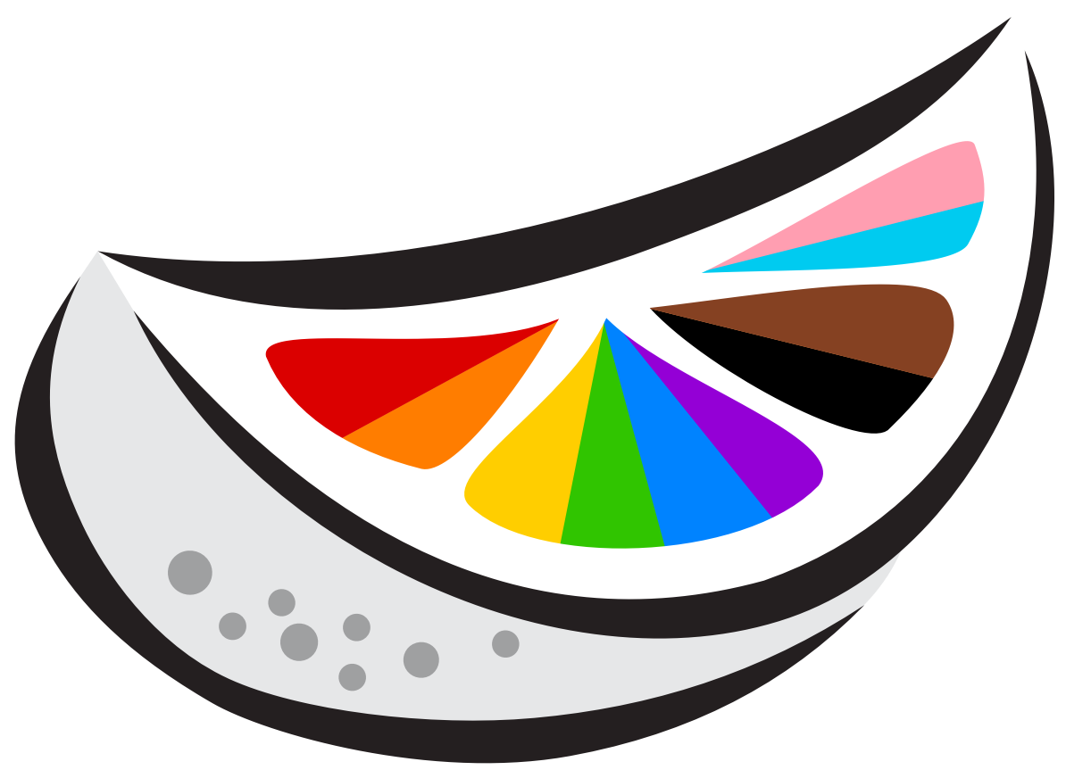
No need to be square! Since 2020, all evergreen browsers have supported shape-outside, which allows the floated shape to take any geometric form and even respects the outline of an image! This can combine nicely with the bump-out effect.
 When browsers that do not support
 shape-outside encounter the style rule, they will simply ignore it. Nothing breaks, but the shape around your image will be the default box shape.
If you would prefer to have more control over the fallback experience, you can start with a simpler, non-floated design and only apply the custom shape once browsers have passed an @supports (shape-outside: url('test.png')) query check.
In summary
Using floats to create columns or grids is dead. But the float property lives on. It’s a helpful tool in the right context. Worth keeping in your toolbox.